Quick Comments Results: Sept. 29
Can you suggest features to include for future events?:
- Maybe a little too fussy in appearance. Some functionality a bit erratic.
-
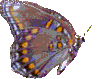
I would say it was high quality, but in some instances I couldn't tell which messages I had read before. As there were so many messages, that web feature was a must. (The butterflies were fine.)
-
Threads and topics could have been set up to be easier to follow. Also the "middle man" screening postings was helpful to some degree in the quality of content, but the delay prevented some meaningful back and forth on topics.
- The structure worked well---I had the ability to look at messages through thread, author, subject and date views. This was excellent. And I would have given you folks a High Quality rating if it hadn't been for your background. I found that the background interferred by almost 'blending' with the text to such an extent that I was unable to read the messages due to eye strain. This is not a usual problem for me. I believe it was your choice of background.
-
This was the first time I've seen this sort of thing. The biggest difficulty was that response messages did not tell enough about the original message.
-
I had definite problems with navigation. I am not sure if it was me or the design of this system.
But it seemed that when I went to the list of posted messges, and then clicked on any specific message, I could navigate only by thread, author, date, etc.--there was no menu item to go back to the main Web home page.
To do that, I had to always go to my browser bookmark for your welcome page which was cumbersome.
Also, I would have enjoyed the option of clicking on a "next message" so the next message would show up right away. I had to click on "date" first, which took me back to the master list of messages for the day, and then locate and click on the next message (arranged in chronological order). So for each message in the queue for each day, I always had to go through the main list. This made message viewing very slow and clumsy for me.
-
I liked the butterflies very much.
- It was fine and dandy to me..it wouldn't bother me if was nondescript..must be all those years reading technical journals.
-
Would like slightly darker letters or fainter background.
The mechanics were fine, except list could be kept on the left to allow split-screen viewing of it and comments.
- Quite satisfactory. No major complaints -- liked the butterfly motif / graphics, especially that the "watermark" did not interfere with download time or legibility.
- The butterfly background was pretty, but also distracting at times. Maybe a less intricate design would be preferable.
- I found it to be really user friendly. I really appreciate that. It might have been better if the butterflies behind the text were a little lighter - blended in a little more. They were a little too prominent and were distracting behind the text. However, it was a nice addition, and I wouldn't like to see them removed completely. Also, the purple flower looked a little like Russian knapweed at first glance. Hopefully it's some kinda daisy instead! The text was excellent. So many web sites use small text which makes it hard to read. Overall, I found it a great site to navigate. Thanks!
-
Easy to use
Simplify the graphics, background is distracting, complicates accessibility and is pretty but unnecessary.
-
The graphics were great, but we have a T-1 connection. I did find the butterfly to be a bit much on my eyes at certain times.
Navigation was better than adequate although a bit ponderous to move from day to day, but perhaps I missed something.
Welcome
| About this Event | Briefing
Book | Join the Dialogue | Search
the Site
|